
Data Visualization Guide: How to Create Compelling Charts and Graphs - matomoexpert

Feb
Presenting data visually is an essential technique for data analysis and data depiction. Data visualization is the representation of data information through clear and engaging graphs and charts. It helps display complex datasets in simpler steps utilizing a combination of textual-numeric data and visual elements.

Data visualization simplifies complexities. It allows us to identify trends, patterns, and correlations that make the concepts apparent. It communicates data, thus making it memorable. Decision makers can easily pinpoint key points and results of a dataset. Any individual who isn’t familiar with statistics or data analysis to interpret and extract basic insights from it.
Here is a structured guide for creating compelling charts and graphs:
Understand your Data:
Before creating a visualization, it’s vital to grasp the dataset thoroughly. Know the variables, their correlations, and the aim that you want to convey through the data. Below are quick points to understand your data:
- Data Exploration: Understand the variables, and their data type and structure.
- Emphasize Key Points: Ensure important data points or trends that you will further visualize.
- Identify Variables: Determine the key variables essential for your analysis. These can include numerical factors such as age or income, or categorical aspects like gender and product category.

Create Right and Compelling Graphs and Charts:
Your data visualization will be of no use if you don’t create the type of chart that represents your data most accurately. The type of chart you select for visualizing your dataset must communicate your message. Following is the list of the best types of charts or graphs:
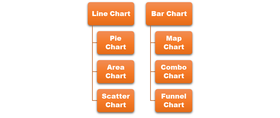
Line Chart:
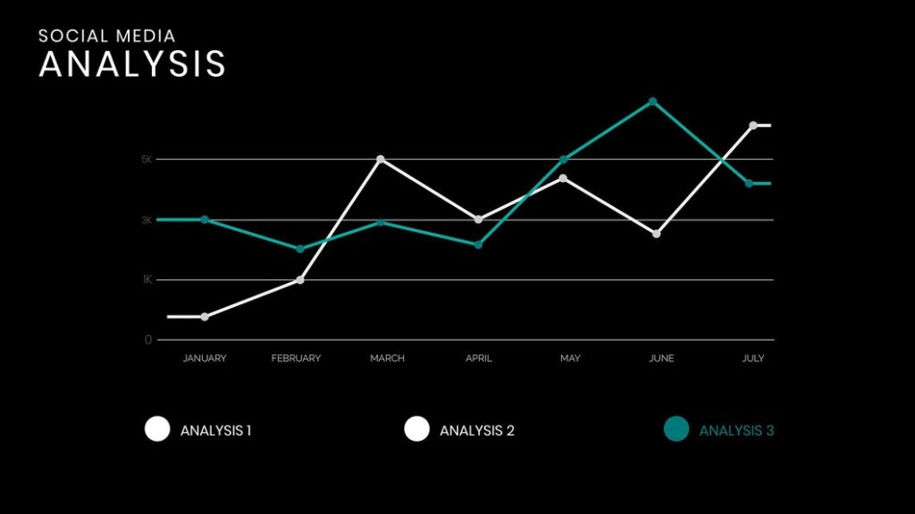
You can select a Line Chart or Graph for visualizing your data over time or if you want to show a connection between two continuous variables. Some common scenarios where a Line Chart can be utilized are:
- Time-series data
- Trend analysis
- Comparing multiple trends
- Trends Showing
- Continuous relationships
Bar/Column Chart:

Use a Bar Chart if you want to display a comparison between categories. It displays discrete categories along one axis (usually the x-axis) and their corresponding values along the other axis (usually the y-axis). Suppose you want to compare the sales performance of different product categories (e.g., electronics, clothing, books) over a specified duration at a retail outlet. A bar chart will better assist you to compare the sales figures for each category. This helps the analysts understand the category contributing the most to overall revenue.
Pie Chart:
Select a Pie chart to represent the percentage or proportion of the total dataset for each category. It showcases figures in percentages and the total sum of all sections equals 100%. It provides a clear visual representation of data to recognize which parts are more or less significant.
Some key uses of pie charts:
- Showing Proportions
- Comparing Categories
- Highlighting Dominant Categories
- Illustrating Market Share
- Budget Allocation
- Visualizing Survey Responses
- Representing Expense Categories
- Showing Sales Breakdown
- Displaying Resource Distribution

Map Chart:
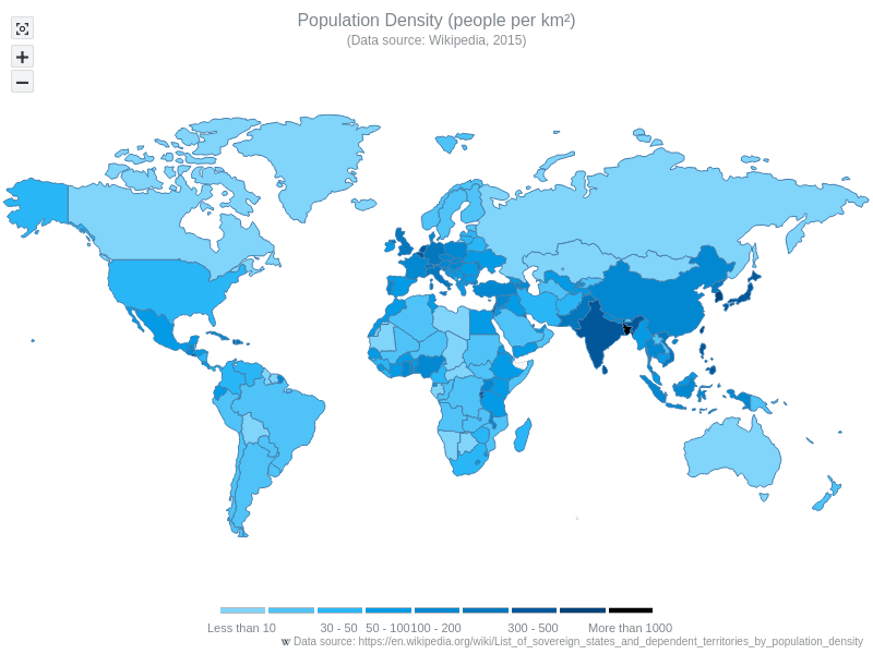
Use a map graph to show any type of data that has geographical relevance such as locations, regions, or spatial distributions/ areas. Following are examples of the types of data that can be effectively displayed in a map chart:
- Population Density
- Sales or Revenue by Region
- Epidemiological Data
- Economic Indicators
- Climate Data
- Tourist Destinations
- Environmental Factors
- Natural Resources Distribution
Area Chart:
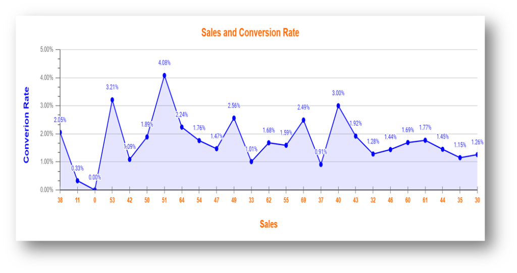
There is a similarity between the area and line chart, but in the area chart, the portion between the x-axis is filled with color. It becomes easy to analyze the magnitude of change over time, thus emphasizing the total values across multiple data series simultaneously. Area charts are fitting for exhibiting the historical performance of financial assets like stocks, indices, or mutual funds. Area charts can also be utilized to depict changes in population demographics across periods. They offer a way to visualize website traffic metrics such as page views, sessions, or unique visitors over time. Each area represents a specific metric, and the combined areas show the overall website traffic trends. You can visit Simple Steps to analyze your website Performance if you are in search of effective methods to analyze your website in better visual terms.
Combo Chart:
A combo chart can be used to visualize two or more types of charts packed into one. It displays a line graph for one sort of information data like sales, and alongside it, we can have bars representing another dataset such as conversions.
A combo chart can be used to visualize two or more types of charts packed into one. It displays a line graph for one sort of information data like Goals Tracking, and alongside it, we can have bars representing another dataset such as E-commerce Order Tracking. Through a combo chart, it becomes easy to analyze a fuller picture of what’s going on with your website or data by seeing multiple sets of information in a single chart.

Scatter Plot Chart:
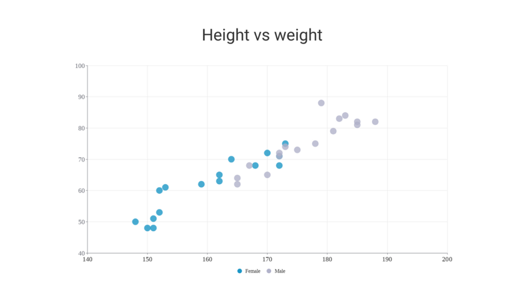
Scatter Chart serves the purpose of illustrating the correlation between two continuous variables. It helps understand patterns, trends, and correlations within the dataset. This type of chart proves valuable here the distinction between independent and dependent variables is unclear or when delving into the relationship between two factors. It can visualize the Relationship between Height and Weight, the Correlation between Study Hours and Exam Scores, and Temperature vs. Ice Cream Sales, etc.
Funnel Chart:
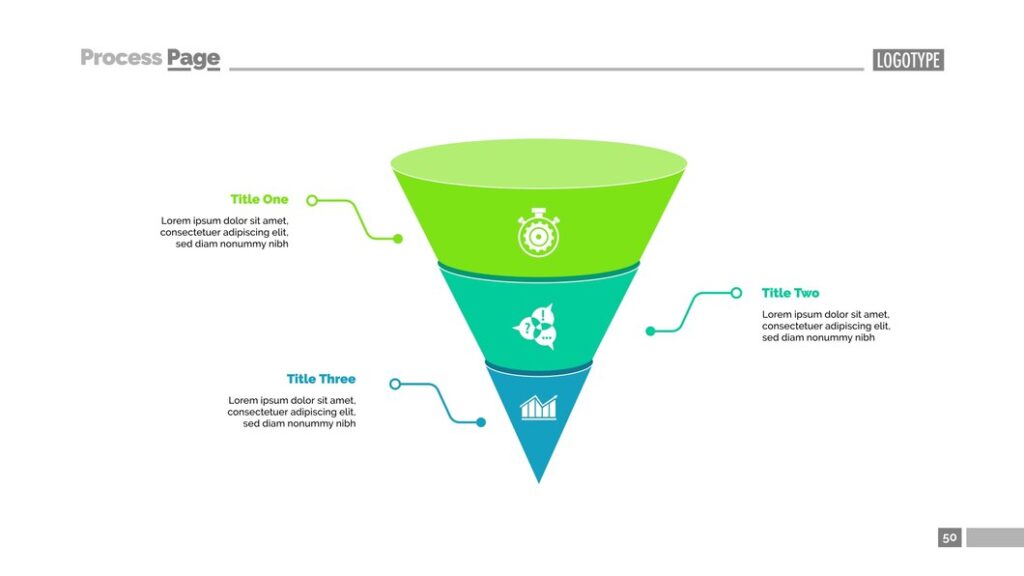
A funnel chart is the best graphical representation employed to illustrate the progressive reduction of data as it passes from one stage to another in a process. The fundamental aim is to spotlight the key stages within a process where there is a significant drop-off or reduction in quantity or value. This type of visualization is commonly used in sales, marketing, and optimizing conversion rates to evaluate the efficacy of sales or marketing funnels.
Keep your Visualizations Simple:
Clarity and comprehension are the fundamental aspects of data visualization. Keep your visualization simple. It involves several key principles:
- Focus on Key Information
- Remove unnecessary elements such as gridlines, excessive text, or decorative elements that distract from the core message
- Use Clear and Concise Labels
- Limit the Number of Variables
- Prioritize Readability
Use Appropriate Colors:
Pick a color scheme that enhances readability. Employ contrasting colors to highlight different categories or data series. Steer clear of excessive color usage, as it can cause distraction.
Confirm Accessibility:
Verify that your visualizations are accessible to all spectators. Select color schemes that are readily distinguishable and offer alternative text for images.

Data visualization simplifies intricate data, thus offering immediate understanding. This uncovers hidden patterns, trends, and connections that may be hidden in raw data. These present data clearly and engagingly. That makes it easy for decision-makers to pinpoint actionable insights quickly. It is more memorable than raw data. It engages audiences and encourages active engagement with data. I would recommend you read blogs from MatomoExpert if you are a professional looking for expert data analysts and data visualizers.
MatomoExpert © 2023 All Rights Reserved